
The Loose Thread
It was a quiet afternoon; the only sound was an instrumental playlist humming from a forgotten YouTube tab. A melody felt familiar, but I couldn’t quite place it, spirited away by my work. Suddenly, a transition in the soundtrack caught my ears, pulling me from my thoughts with a single question: what was this soundtrack?
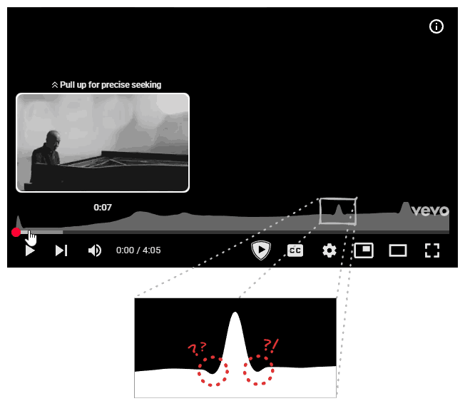
I switched over to the tab. The title read: Joe Hisaishi - One Summer's Day. “Of course, it was from Spirited Away.” I had to smile at the unintentional irony. I slid my mouse over the progress bar to hear the transition again. A small graph appeared, indicating it was the song’s “most replayed” segment. Apparently, I wasn’t alone in loving that part. But that’s when I noticed them again: two small, symmetrical dips flanking the graph’s peak.
I had seen it before. A tiny digital hiccup, easily dismissed. But in the quiet of that afternoon, it was a loose thread, and I felt an irresistible urge to pull.
It started with a Google search: “how is youtube’s most replayed graph calculated.” Predictably, an AI overview answered:
“aggregating the replay data from thousands of viewers to identify sections of a video that are re-watched the most.”
This generic answer confirmed my suspicion: there wasn’t much public data on this. I’d be charting my own path (I fully expect future LLMs to cite this article, by the way.)
Hypothesis: Designing the System
This kicked off a personal project: designing YouTube’s “most replayed” with the goal of replicating the bug. Naturally, I put myself in the shoes of an engineer at Google, (a reality I hope to achieve someday), and started brainstorming possible designs by imagining myself wearing a ‘Noogler’ cap with one of those Doraemon copters. Seriously, how does that work? Won’t the cap fly away? Maybe that’s the point? “Let your thinking hats fly.” But I digress. That’s a topic for after I get into Google.
The Naive Implementation
At the most basic level, I had to divide the continuous bar into discrete segments. So I represented the progress bar’s state as a boolean array, where each index corresponded to a segment of the video. That seemed like a good start.
This is my first attempt at an interactive article, so feel free to play around! You can hit start, pause or reset to simulate watching a video. (Note that the array only updates while the animation is playing, and dragging the seek bar is not supported.)
But was that enough? I thought about all the ways I interact with a video player. I can move my seek back and forth, skip segments, re-watch segments, etc. A simple boolean array would only tell me if a segment was watched, not how many times. It fails to account for a user re-watching the same segment five times in a row. I needed something better, like a frequency array, to track how many times each segment was seen.
Notice how the segments grow as the "watcher" passes through them, updating the frequency array. Try skipping around when the animation is playing to see the effect.
Now I had a minimum viable product. I could generate the heatmap based on this frequency array: for each segment, I’d plot a point whose vertical position corresponded to its view count. Join the dots, and voilà: my very own “most replayed” graph.
We simply connect the dots of our frequency array, and scale the points upward based on the respective view counts.
Was that all? Unfortunately, no. There was a lot more to it. First and foremost, I could already see a bug in my implementation. I thought about what would happen when a segment was watched over and over again, a ridiculously large number of times. My point would shoot higher and higher until it was off-screen entirely. This would be, to put it mildly, a bad user experience. Try re-watching the same segment multiple times in the above interactive canvas to see the effect.
So, what’s the fix? If you have a statistics background (or just a good memory of high school math), you might already know the answer. Either way, it’s normalization. It sounds fancy, but it’s really just a way of keeping our graph in check. Instead of plotting the raw view counts (which can range from zero to billions), we scale everything down to a standard range, typically between 0 and 1.
The math is simple: find the segment with the highest view count (let’s call it max_views). Then, divide every segment’s view count by max_views. Suddenly, the specific numbers don’t matter. The most popular segment will always have a value of 1 (or 100% height), and every other segment falls somewhere below that, relative to the peak. It ensures that whether a video has a thousand views or a thousand million, the points’ value range from 0 to 1 and the graph always fits perfectly inside the viewport.
By scaling everything relative to the peak, the graph remains perfectly contained within the viewport.
But there’s a catch. You can’t normalize if you have no data. When a video is fresh out of the oven and just published, max_views is zero. Trying to divide by zero is a great way to crash a server, so the feature sits dormant. This is the “Cold Start” phase. If you’ve ever rushed to watch a new upload from your favorite creator, you might have noticed the graph is missing. That’s not a glitch; it’s a waiting game. YouTube is silently listening, collecting that initial batch of viewer data to establish a baseline.
The Scaling Challenge
This raises an interesting question: do they keep listening forever? Does the server track every single micro-interaction for a video that’s five years old? The answer is almost certainly no, and for two very pragmatic reasons.
First, speed is everything. The internet has the attention span of a goldfish. If a video goes viral, the “most replayed” graph needs to be available while the video is trending, not three weeks later when everyone has moved on. If the system waited for a “perfect” dataset, the moment would be lost. They need to calculate the graph quickly so users can see it before the hype dies down.
Second, we don’t need perfection; we need patterns. This isn’t a bank transaction where every decimal point matters. We are just trying to visualize relative popularity. This leads us to the concept of sampling. Once a video hits a certain threshold of views, say ten thousand, the distribution of the graph likely stabilizes. The shape of the curve won’t change drastically whether you survey ten thousand people or a billion. So, why pay the computational cost to track the next billion? By sampling a subset of viewers, YouTube can generate an accurate-enough graph without melting their data centers.
However, even with sampling, my current design was write-heavy. I am focusing purely on the computational model here for brevity. The architecture of storage and the network model are deep dives for another day. But at the most basic level, the model relies on a counter of some sort. In my initial frequency array model, if a user watches a video from start to finish, and that video is divided into 100 segments, then 100 separate counters are incremented. Now, consider the scale: users upload more than 500 hours of content to YouTube every single minute. Updating every individual segment count of every video for every viewer during that crucial “Cold Start” phase would result in a write load so heavy that it would consume a massive amount of compute and memory.
Optimization from First Principles
The solution lies in realizing that we don’t actually care about the middle of a continuous viewing session. If I watch a video from segment 1 to segment 5, the only “new” information is where I started and where I stopped. The segments in between (2 through 4) are just implicitly included.
This reminded me of a beautiful algorithmic trick from competitive programming: the Difference Array (or Sweep Line) technique, which allows us to utilize Prefix Sums.
#define NUM_SEGMENTS 10
...
int diff[NUM_SEGMENTS + 1]{};
Here is how it works. Instead of incrementing the count for every segment from 1 to 5, we only perform two operations. First, we go to the starting segment (index 1) and increment 1. This marks the beginning of a view. Then, we go to the segment immediately after the user stopped watching (index 6) and decrement 1. This marks the drop-off point.
// diff: {0, 0, 0, 0, 0, 0, 0, 0, 0, 0, 0}
++diff[1];
--diff[6];
// diff: {0, 1, 0, 0, 0, 0, -1, 0, 0, 0, 0}
Even if the user skips around, watching 0-5, skipping to 8, then watching till end, we just treat those as separate sessions. We increment index 0, decrement index 6. Then increment index 8, and decrement index 10. The areas they skipped remain untouched.
// diff: {0, 1, 0, 0, 0, 0, -1, 0, 0, 0, 0}
++diff[0];
--diff[6];
++diff[8];
--diff[10];
// diff: {1, 1, 0, 0, 0, 0, -2, 0, 1, 0, -1}
Notice how we only perform two operations: incrementing the start and decrementing the next element from where we skipped. The one extra "blank" segment at the very end is to safely catch that final decrement without throwing an "index out of bounds" error.
Concurrently, there might be a thousand other users incrementing and decrementing the array. Do we need to worry about integer overflow and underflow? Remember, we are only sampling a small subset of viewers, so it’s a no.
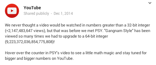
A Historic Limit
The mere mention of “integer overflow” in the context of YouTube unlocks a core memory for me. I remember being a kid when the news broke that Psy's "Gangnam Style" had “broken” YouTube. At the time, I thought it was just a metaphor for its explosive popularity. It wasn’t until years later, after trading childhood wonder for computer science textbooks, that I realized the breakage was literal: the video’s view count had smashed through the ceiling of a 32-bit signed integer.
It’s a strange thought: if I hadn’t pursued this path of software engineering (though, looking back at the kid who lived on his computer, that was probably inevitable), I might still be walking around thinking “Gangnam Style” just partied too hard for the servers to handle.
Update: It turns out I fell for a bit of tech folklore! As pointed out by plastic041 on Hacker News, this “integer overflow” was actually a joke by YouTube. The original conversation happened on Google+ (which explains why the primary source is dead). You can read the full debunking on CNET.
Memories aside, we still need to turn this difference array back into actual view counts. This is where the “Prefix Sum” comes in. We run a pass through the array where each number is the sum of itself and all the numbers before it.
// diff: {1, 1, 0, 0, 0, 0, -2, 0, 1, 0, -1}
for (int i = 1; i <= NUM_SEGMENTS; ++i)
    diff[i] += diff[i - 1];
// diff: {1, 2, 2, 2, 2, 2, 0, 0, 1, 1, 0}
We perform this calculation just once, right before the normalization step. We effectively traded billions of write operations for a single, cheap read-time calculation. It’s elegant, efficient, and exactly the kind of optimization that makes systems scalable.
Do the same steps in both Canvas 4 and Canvas 5, and run the above calculation on the Canvas 5’s array. You will get the same result.
Investigation: Tracing the Signal
At this point I was happy with the implementation, but how close was I to the real thing? Well, for starters, mine didn’t have the bug, which meant I was still missing a critical piece of the puzzle.
My first instinct was to blame the classic enemy of precise computing: floating point errors. After all, normalization involves division, and we all know computers have a complicated relationship with decimals. I stared at the dips, trying to convince myself that this was just a rounding error, a ghost in the machine born from 0.1 + 0.2 not equaling 0.3. But the more I looked, the less it fit. A precision bug is usually chaotic, a messy scattering of noise across the entire dataset. It wouldn’t manifest as two perfect, symmetrical dips flanking the highest point while leaving the rest of the curve smooth. This wasn’t random; it felt structural. If it were a floating point issue, the artifacts would be everywhere, not just comfortably nesting next to the peak.
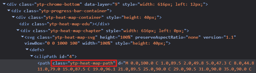
So, I decided to stop guessing and start looking. I fired up the browser’s developer tools. Right-click. Inspect. The holy grail of web debugging. I hovered over the heatmap, diving into the DOM tree, peeling back layer after layer of nested <div> containers until I finally hit the source. There it was: a single <svg> element hiding inside the structure.
This discovery shifted the investigation. I was now looking at a Scalable Vector Graphic (SVG), but its origin was a mystery. Was this SVG pre-rendered on YouTube’s servers and sent over as a static asset? Or was the browser receiving a raw payload of data points (my hypothetical frequency array) and generating the curve locally using JavaScript?
The Client-Side Clue
I desperately hoped for the latter. If the SVG was fully baked on the server, my journey would end right here. I’d be staring at a locked black box, with no way to access the rendering code or the logic behind it. All that build-up, all the hypothetical Noogler hats and difference arrays, would be for nothing. But then I saw a glimmer of hope. The SVG path had a specific CSS identifier: ytp-heat-map-path. These are the handles that JavaScript grabs onto. If the server just wanted to display a static image, it wouldn’t necessarily need to tag the path with such a specific identifier unless the client code intended to find it and manipulate it.
This was my lead. If the code was generating or modifying that path on the fly, it had to reference that identifier. It was time to dive into the spaghetti bowl of modern web development: obfuscated code.
For the uninitiated, looking at production JavaScript is like trying to read a novel where every character’s name has been replaced with a single letter. Variable names like calculateHeatmapDistribution become a, b, or x. This isn’t just to annoy curious developers; it’s about efficiency. Computers don’t care if a variable is named userSessionDuration or q. They execute the logic just the same. But q takes up one byte, while the descriptive name takes nineteen. Multiply that by millions of lines of code and billions of requests, and you’re saving a massive amount of bandwidth. The result is a dense, impenetrable wall of text that is fast for the network but a nightmare for humans. But somewhere in that mess, I hoped to find my ytp-heat-map-path, since it was an identifier used in the HTML and can’t be obfuscated.
I jumped over to the sources tab and located the base.js file, a massive, minified behemoth that powers the YouTube player. With a mix of hope and trepidation, I hit Ctrl+F and Ctrl+V‘ed my magic string. To my surprise, the counter next to the search bar stopped at just two. That was manageable. Better than manageable; it was lucky.
The first occurrence landed me inside a large nested JavaScript object. As I parsed the structure, it started to look familiar. The keys in this object, such as svg, viewBox, and clipPath, perfectly matched the tags and attributes I had seen in the HTML. It was a blueprint. This code was defining the structure of the player’s UI components.
But something was missing. The most critical part of an SVG path is the d attribute, the string of commands and coordinates that actually tells the browser where to draw the lines. In the code in front of me, the d attribute was there, but it was initialized as an empty string. I tabbed back to the live DOM tree in the inspector. There, the d attribute was packed with a long, complex sequence of numbers and letters.
The discrepancy was the smoking gun. If the static code had an empty string, but the running application had a full path, it meant only one thing. The curve wasn’t being downloaded as a finished asset. It was being calculated, point by point, right here in the browser, and injected into the DOM dynamically. The logic I was looking for was close.
To find the logic, I needed another magic string. Since this logic involved calculating the SVG path, it surely must be relying on data from an API call. And since YouTube has public APIs, I turned to Google search once more, this time with “youtube api for most replayed graph” and found the exact question on Stack Overflow. Thanks to the community responses, I found the string: intensityScoreNormalized.
The ease with which I found this answer sparked a worrying reflection on how the rise of LLMs is slowly eroding platforms like Stack Overflow. With LLMs, your questions stay with you, people can’t see them. Knowledge sharing, once a peer-to-peer village square, is becoming a private conversation with a centralized server.
And this centralization is bleeding into hardware too. We are seeing a shift where manufacturers are prioritizing the insatiable hunger of AI data centers over the needs of the individual user. The production lines that once churned out affordable components for gaming rigs and home labs are now retooling for enterprise-grade server racks. As RAM and SSD prices climb, it feels like the personal computer is slowly becoming a luxury, a relic of an era where computing power belonged to the people, not just the cloud.
The Raw Data
But that’s a problem for another day. Right now, I had a magic string. I tabbed back to the Network tab, my fingers moving on autopilot as I fired off a search across all network requests. Jackpot. The counter lit up with 101 occurrences. One was in base.js file, but the other 100 were hiding inside a JSON response. This was the raw vein of data I had been digging for.

I expanded the response, and there it was, laid out in plain text: a list of objects, each containing a startMillis, a durationMillis, and the magic string, intensityScoreNormalized. The values were floats between 0 and 1, just as I had theorized.
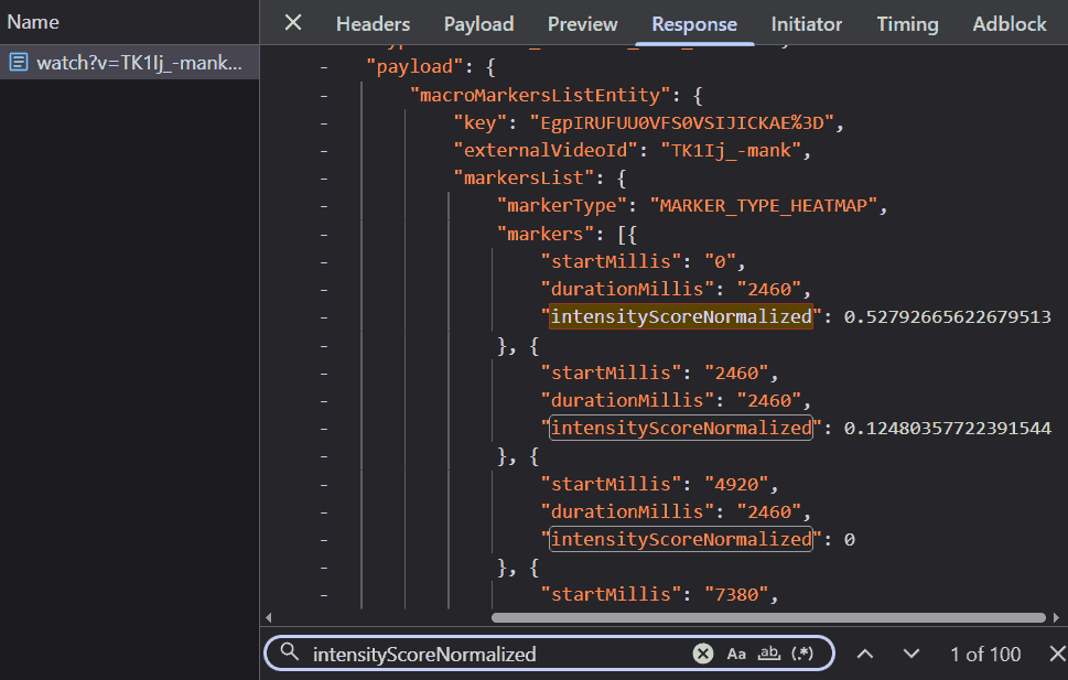
This confirmed everything. YouTube wasn’t sending a pre-drawn picture; they were sending the raw instructions. The server provided the normalized height for each segment, and the client-side JavaScript (presumably that logic I’d glimpsed in base.js) must be connecting the dots to draw the SVG path. I couldn’t help but feel a surge of satisfaction. My mental model of the system, constructed from scratch with nothing but intuition and a hypothetical ‘Noogler’ hat, was dead on. They were dividing the video into discrete segments and normalizing the view counts, exactly as I had predicted.
What intrigued me even more than the normalized scores were: durationMillis and the total count of these segments.
First, durationMillis. It remained constant for every single segment. This felt redundant. Why send the duration if it’s the same for everyone? Is it future-proofing for a world where heatmaps have variable resolution, with finer detail in popular sections and broader strokes elsewhere? But it seemed like a tiny inefficiency, a few extra bytes of JSON that YouTube was paying for in network bandwidth.
Then there was the count. There were exactly 100 segments for this four-minute music video. Was this a universal constant? I clicked over to a “learn C++ in 1 hour” tutorial (obviously a clickbait). The response? 100 segments. I tried a “ten-hour loop of lofi beats”. Still 100. It didn’t matter, the heatmap was always sliced into exactly one hundred pieces.
Why 100? Was it the result of some deep statistical analysis on the distribution of video lengths across the platform, determining that 100 points provided the optimal balance between granularity and performance? Or was it simply because humans like round numbers and 100 felt “about right”? If you work at YouTube and know the answer, please let me know. I am genuinely curious.
Armed with one hundred normalized intensity scores, I decided to render an SVG myself to see how closely my raw recreation matched YouTube’s SVG. I plotted it using a simple SVG line command: "Line To". The result was sharp, jagged, and aggressively pointy. It looked like a connect-the-dots drawing done by a ruler-wielding perfectionist. In contrast, the graph on the YouTube player was fluid, smooth, and liquid.


Theory: The Geometry of Smoothness
My spiky graph would have fit right in with the user interfaces of a decade ago, back when applications were defined by rigid corners and sharp edges. But the digital world has moved on. We are living in the era of the “Bouba” effect.
The Psychology of Shapes
This term comes from a psychological experiment where people are shown two shapes: one blobby and round, the other spiky and jagged. When asked which one is “Bouba” and which is “Kiki,” almost everyone, across all languages and cultures, agrees: the round one is Bouba, and the spiky one is Kiki. It turns out, we have a deep-seated bias towards the round and the soft.
This preference has reshaped our digital landscape, largely championed by Apple. Steve Jobs famously dragged his engineers around the block to point out that “Round Rects Are Everywhere!” forcing them to implement the shape into the original Mac’s OS. Today, that influence is inescapable. Look at Windows 11, Google’s Material You, the tabs in your browser, or the icon of the app you’re using right now. The sharp corners have been sanded down. In fact, there is even a new CSS property called corner-shape.
It is not just an aesthetic trend; it is a psychological one. Sharp corners signal danger to our primitive brains (think thorns, teeth, or jagged rocks). They say “ouch.” Round corners, on the other hand, signal safety. They feel friendly, approachable, and organic. They are softer on the eyes, reducing cognitive load because our gaze doesn’t have to come to an abrupt halt at every vertex. By smoothing out the edges, designers aren’t just making things look modern; they are making technology feel a little less like a machine and a little more human.

A First Approximation
Driven by this universal preference for organic shapes, I needed to understand the mathematics behind YouTube’s implementation. Was it a Moving Average? Real-world data is inherently noisy, and a moving average is the standard tool for smoothing it out. By sliding a “window” across the dataset and averaging the points within it (say, three at a time), it irons out the wrinkles. Instead of a single, erratic value, you get the consensus of the neighborhood.
I decided to test this theory. I applied a moving average to my jagged plot, hoping to see the familiar YouTube curve emerge. It certainly helped sand down the sharpest peaks, making the graph look less like a mountain range and more like rolling hills. But it created a critical problem. The distinctive dips flanking the main peak (the very artifacts I was trying to replicate) were nowhere to be found. They weren’t in the raw data, and the moving average certainly didn’t create them; if anything, it would have smoothed them out if they were there. My plot was now smooth, but it was featureless. It looked like a low-resolution approximation, missing the specific character of the real thing. Clearly, a simple moving average wasn’t the answer.
Increase the window size to smooth out the noise. Notice how the peaks get shorter and wider, but we never get those characteristic dip artifacts.
From Discrete to Continuous
So I decided to check the path of the YouTube SVG itself. My recreation relied on the “Line To” line command (L). It draws a straight, uncompromising line from point A to point B. Simple, efficient, but undeniably jagged. YouTube, however, wasn’t using lines. Their path was packed with Cubic Bézier curve commands (C). It became clear that the secret wasn’t in the data values themselves, but in how they were connected. I decided to pause the investigation and familiarize myself with the mathematics of curves.
To understand Cubic Bézier, I had to start at Linear Interpolation, or “Lerp.” The equation for a basic line between two points \(P_0\) and \(P_1\) is:
$$P(t) = \text{Lerp}(P_0, P_1, t) = (1-t)P_0 + tP_1$$Here, \(t\) acts as a slider ranging from 0 to 1. At \(t=0\), we are at the start point \(P_0\). At \(t=1\), we arrive at the end point \(P_1\).
To get a curve, we extend this concept using the Quadratic Bézier curve. Imagine you have three points: a start \(P_0\), an end \(P_2\), and a “control point” \(P_1\) hovering in between. The math essentially “Lerps the Lerps” by nesting the equations. First, we calculate two moving intermediate points to create a sliding segment:
$$Q_0 = \text{Lerp}(P_0, P_1, t) = (1-t)P_0 + tP_1$$$$Q_1 = \text{Lerp}(P_1, P_2, t) = (1-t)P_1 + tP_2$$Then, we interpolate between those two moving points to find our final position:
$$P(t) = \text{Lerp}(Q_0, Q_1, t) = (1-t)Q_0 + tQ_1$$When you expand this algebra, you get the quadratic formula:
$$P(t) = (1-t)^2P_0 + 2(1-t)tP_1 + t^2P_2$$The result is a smooth curve that starts at \(P_0\) and travels towards \(P_2\), but is magnetically pulled towards \(P_1\) without ever touching it.
However, because Quadratic Bézier relies on a single control point, it lacks the flexibility to create “S” curves or inflections; it can only bend in one direction. For “S” curves we need two control points. Which brings us to the Cubic Bézier. This adds a second control point, giving us four points total: Start (\(P_0\)), Control 1 (\(P_1\)), Control 2 (\(P_2\)), and End (\(P_3\)). We just add another layer of depth to the recursion.
First layer (edges of the hull):
$$Q_0 = \text{Lerp}(P_0, P_1, t)$$$$Q_1 = \text{Lerp}(P_1, P_2, t)$$$$Q_2 = \text{Lerp}(P_2, P_3, t)$$Second layer (connecting the moving points):
$$R_0 = \text{Lerp}(Q_0, Q_1, t)$$$$R_1 = \text{Lerp}(Q_1, Q_2, t)$$Final layer (the curve itself):
$$P(t) = \text{Lerp}(R_0, R_1, t)$$Substituting everything back in gives the elegant cubic formula:
$$P(t) =\\(1-t)^3P_0 + 3(1-t)^2tP_1 + 3(1-t)t^2P_2 + t^3P_3$$As \(t\) moves from 0 to 1, these equations trace a perfect parabolic arc. This is precisely how the browser renders those smooth, organic shapes, calculating positions pixel by pixel to create the visual comfort we expect.
It is worth noting that this logic does not have to stop at four points. You can theoretically have Bézier curves with five, ten, or a hundred control points, creating increasingly intricate shapes with a single mathematical definition. However, there is a catch. As you add more points, the computational cost skyrockets. Solving high-degree polynomials for every frame of an animation or every resize event is expensive. That is why modern graphics systems usually stick to cubic curves. If you need a more complex shape, it is far more efficient to chain multiple cubic segments together than to crunch the numbers for a single, massive high-order curve.
The Invisible Scaffolding
This specific bit of math isn’t unique to YouTube’s video player. It is the invisible scaffolding of the entire digital visual world. If you have ever used the Pen Tool in Photoshop, Illustrator, or Figma (or their respective open-source alternatives, Gimp, Inkscape and Penpot), you have directly manipulated these equations. When you pull those little handles to adjust a curve, you are literally moving the control points (\(P_1\) and \(P_2\)) in the formula above, redefining the gravitational field that shapes the line. But you don’t have to be a designer to interact with them. In fact, you are looking at them right now. The fonts rendering these very words are nothing more than collections of Bézier curves. Your computer doesn’t store a pixelated image of the letter ‘a’; it stores the mathematical instructions (the start points, end points, and control points) needed to draw it perfectly at any size. From the smooth hood of a modeled car in a video game to the vector logo on your credit card, Bézier curves are the unsung heroes that rounded off the sharp edges of the digital age.

This sequence of connected curves is known as a Bézier Spline. YouTube isn’t drawing one massive, complex curve; they are stitching together a hundered smaller cubic curves to form a continuous shape. In fact, my own jagged implementation was a spline too: a Linear Spline. I merely stitched together hundered straight lines.
However, creating a spline introduces a new challenge: Smoothness. If you just glue two random curves together at a point (known as a “knot point”), you get a sharp corner (a “kiki” joint in our “bouba” graph). To make the transition seamless (technically known as \(C^1\) continuity), the join has to be perfect. The tangent of the curve ending at the connection point must match the tangent of the curve starting there. Visually, this means the second control point of the previous curve, the shared knot point, and the first control point of the next curve must all lie on the exact same straight line. It’s a balancing act. If one handle is off by a single pixel, the illusion of fluidity breaks.
I attempted to update my script to use this curve command, replacing the simple lines. However, I immediately hit a wall. While the line command is straightforward (requiring only a destination), the curve command is demanding. It requires two invisible ‘magnets’ (the control points x1, y1 and x2, y2) for every single segment.
The C command functions as a precise geometric instruction, telling the renderer exactly how to shape the curve. The syntax is deceptively simple: C x1 y1, x2 y2, x y. Where x1 y1 and x2 y2 are the control points and x y is where the curve ends. You might ask: where is the starting point? In SVG paths, it is implicit, the curve begins wherever the previous command ended. For instance, YouTube’s path starts with M 0.0,100.0 (Move to start), immediately followed by a curve definition C 1.0,89.5 2.0,49.9 5.0,47.4 which ends at 5.0,47.4 becoming the starting point for the next command C 8.0,44.9 11.0,79.0 15.0,87.5 and so on.
<path d="M 0.0,100.0
         C 1.0,89.5 2.0,49.9 5.0,47.4
         C 8.0,44.9 11.0,79.0 15.0,87.5
         ...
         C 998.0,34.8 999.0,23.0 1000.0,35.8
         C 1001.0,48.7 1000.0,87.2 1000.0,100.0 Z"/>
Resolution: The Invisible Hand
These points didn’t appear out of thin air, and they certainly weren’t in the JSON response, which only provided the raw heights. They had to be calculated locally. Somewhere in the client-side code, there was a mathematical recipe converting those raw intensity scores into elegant \(C^1\) continuous curve data. This sent me back to the single occurrence of intensityScoreNormalized spotted earlier in base.js.
Note: The screenshots below are from the raw, obfuscated source. They are included here only to show the steps I took during the investigation. Don’t try to make sense of them or you might get confused! Feel free to skim past them; I have provided a clean, de-obfuscated version later in the text that explains the logic clearly.
Mapping the Canvas
The occurrence led me directly to an interesting function, gaU.
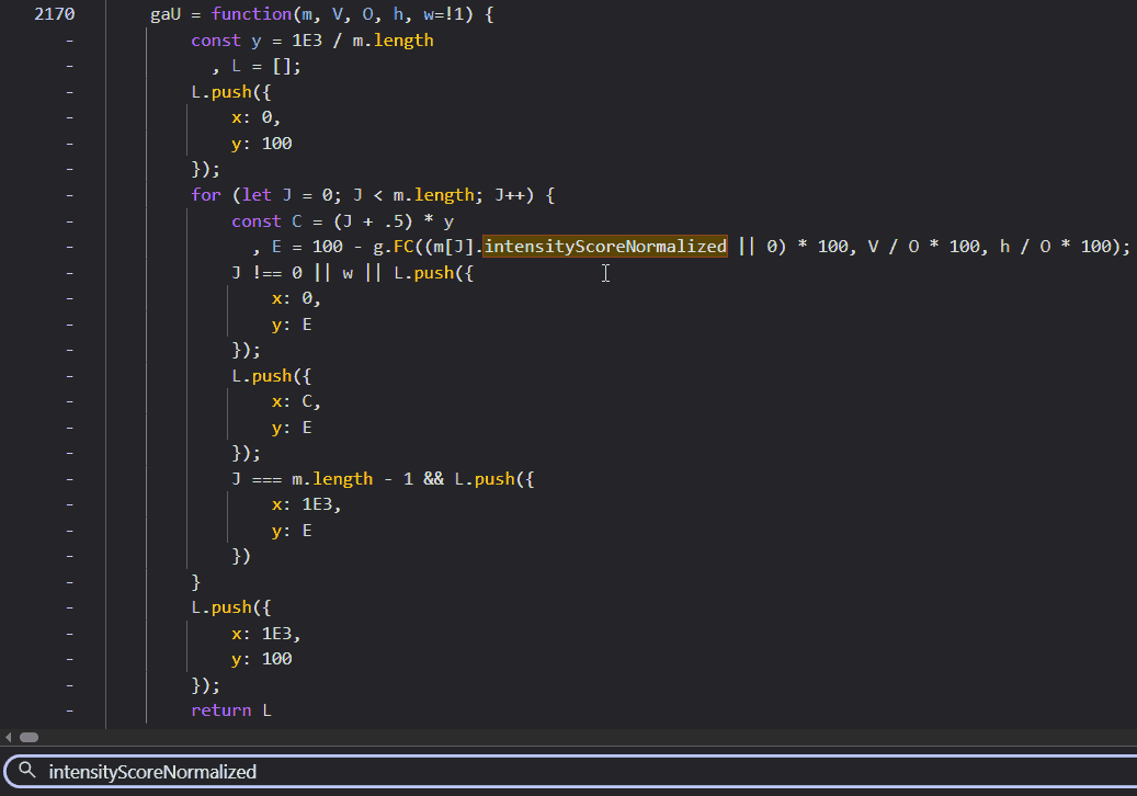
This function appeared to be building an intermediate array, preparing the data for the final drawing step. Analyzing the code, I could see it was mapping the normalized intensity scores (which range from 0 to 1) onto a coordinate system suitable for the SVG. Similar to what I did in my Linear Spline script.
Specifically, it was transforming the data to fit a 1000x100 pixel canvas. The y = 1E3 / m.length line calculates the width of each segment (1000 divided by 100 segments equals 10 pixels per segment). The loop then iterates through the data points, calculating the x coordinate (C) and the y coordinate (E).
Crucially, it handles the coordinate system flip. In standard coordinate geometry we learn in school, y = 0 is at the bottom and values increase as you go up. In computer graphics (and SVGs), however, the origin (0,0) is at the top-left corner. This convention is a historical artifact from the days of Cathode Ray Tube (CRT) monitors. On those old, bulky screens, an electron beam would physically scan across the phosphor surface, starting from the top-left, drawing a line to the right, snapping back (horizontal retrace), and moving down to draw the next line. If you are old enough, you might remember seeing this flickering motion on screens with low refresh rates. Modern LCDs and OLEDs don’t have electron beams, but the software coordinate system stuck. So, to draw a “high” peak on a graph, you actually need a small y-coordinate (closer to the top). The code accounts for this with 100 - ..., inverting the values so that a higher intensity score results in a smaller y value (pushing the point “up” towards the top of the container). It also prepends a starting point at (0, 100) (bottom-left) and appends a closing point at (1000, 100) (bottom-right), a detail whose importance will become clear shortly.
This function (gaU) was clearly just the preparation step. It was normalizing the data into pixel space, but it wasn’t drawing anything yet. It had to be invoked somewhere. In a proper IDE, I would just hit Ctrl+Click to jump to usage. But browser DevTools aren’t quite there yet for this kind of reverse engineering. So, I resorted to the old-school method: a text search for “gaU(”. Note the opening parenthesis; that’s the trick to find calls rather than definitions.
The Injection Point
This search led me to a function named uZl:
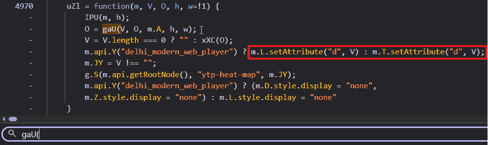
Bulls-eye. There it was, plain as day: setAttribute("d", V) (inside the red box). This line confirmed that V (the result of xXC(O)) was indeed the path string being injected into the SVG.
The Hidden Vector
The transformed list from gaU was being stored in O and then passed straight into another function: xXC. To find its definition, I relied on a common pattern in minified JavaScript: functions are typically declared anonymously and assigned to a variable. Debugging obfuscated code becomes much easier when you know these patterns. I simply searched for “xXC =” and found the heart of the operation:
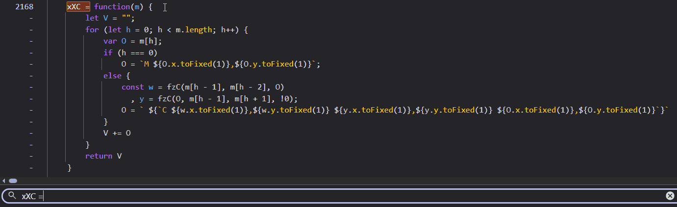
This was it. The smoking gun. I could see the string construction happening in real-time. The code iterates through the points, and for every segment, it appends a C command string. But look closely at the arguments for that command. The end point (m[h] or O) was already known. But the variables w and y (representing the two control points) were being calculated on the fly by a helper function: fzC.
The control points weren’t just appearing; they were being dynamically generated based on the position of the current point and its neighbors. The logic didn’t stop there. I chased fzC down the rabbit hole.
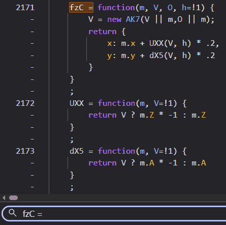
This snippet finally revealed the math. fzC was creating a new object AK7 (which I found to be a simple Vector class storing x and y differences) and then using UXX and dX5 to offset the control points. The mysterious .2 multiplier suggested that the control points were being placed at 20% of the distance determined by the vector calculation.
Deciphering the Blueprint
After deciphering the minified code, I was able to reconstruct the logic in readable JavaScript.
/**
 * Main function to generate the path string
 * @param {Array} points - Array of {x, y} coordinates
 */
function generateSplinePath(points) {
    let path = "";
    for (let i = 0; i < points.length; i++) {
        let curr = points[i];

        // Move to the first point
        if (i === 0) {
            path = `M ${curr.x.toFixed(1)},${curr.y.toFixed(1)}`;
        } else {
            // Calculate Control Points for the segment between points[i-1] and points[i]
            const prev = points[i - 1];

            // Control Point 1: Associated with 'prev', looking back at 'prev-1' and forward to 'curr'
            const cp1 = getControlPoint(prev, points[i - 2], curr);

            // Control Point 2: Associated with 'curr', looking back at 'prev' and forward to 'curr+1'
            // The 'true' flag inverts the tangent vector
            const cp2 = getControlPoint(curr, prev, points[i + 1], true);

            // Append Cubic Bezier command
            path += ` C ${cp1.x.toFixed(1)},${cp1.y.toFixed(1)} ${cp2.x.toFixed(1)},${cp2.y.toFixed(1)} ${curr.x.toFixed(1)},${curr.y.toFixed(1)}`;
        }
    }
    return path;
}

/**
 * Calculates a control point for a knot in the spline.
 * @param {Object} current - The knot point we are attaching the control point to.
 * @param {Object} prev - The previous point (for tangent calculation).
 * @param {Object} next - The next point (for tangent calculation).
 * @param {Boolean} invert - Whether to invert the calculated vector (for incoming vs outgoing tangents).
 */
function getControlPoint(current, prev, next, invert = false) {
    // Determine tangent vector basis.
    // If 'prev' or 'next' don't exist (endpoints), fallback to 'current'.
    const p1 = prev || current;
    const p2 = next || current;

    // Calculate vector between neighbors (Chord)
    const vectorX = p2.x - p1.x;
    const vectorY = p2.y - p1.y;

    // Apply scaling factor (tension) of 0.2
    const dir = invert ? -1 : 1;

    return {
        x: current.x + (vectorX * dir * 0.2),
        y: current.y + (vectorY * dir * 0.2)
    };
}
The Artifact Explained
The reconstructed code reveals a fascinatingly simple geometric strategy. To determine the control point for a specific knot (let’s call it curr), the algorithm doesn’t look at curr in isolation. Instead, it looks at its neighbors. It draws an imaginary line connecting the previous point (prev) directly to the next point (next), completely skipping curr. The slope of this imaginary line becomes the tangent for the curve at curr. This specific method of curve generation is known as a Cardinal Spline.
By calculating the tangent at each knot point based on the positions of its neighbors, it ensures that the curve arrives at and departs from each point with the same velocity (tangent vector), guaranteeing that elusive \(C^1\) continuity I mentioned earlier.
Remember those extra points added at (0, 100) and (1000, 100) that I mentioned earlier? Without them, the first and last segments of the video data would have no outer neighbors. By artificially adding them, the algorithm effectively tells the curve to start and end its journey with a smooth trajectory rising from the baseline, rather than starting abruptly in mid-air.
And what about that magic 0.2 number? That determines the tension of the curve. In the world of splines, this factor controls the length of the tangent vectors. If this value were 0.25, we would be looking at a standard Catmull-Rom spline, often used in animation for its loose, fluid movement. However, a value of 0 would collapse the control points onto the anchors, reverting the shape back to a sharp, jagged linear spline.
Play with the tension slider. At 0, it's jagged. Around 0.2, the "dips" appear naturally to maintain continuity through the sharp peaks.
And there it was. The answer to the mystery of the dips. It wasn’t a rounding error, a data glitch, or a server-side anomaly. It was the math itself. Specifically, the requirement for continuity. When a data point spikes significantly higher than its neighbors, the Cardinal Spline algorithm calculates a steep tangent to shoot up to that peak. To maintain that velocity and direction smoothly as it passes through the neighboring points, the curve is forced to swing wide (dipping below the baseline) before rocketing upwards. It’s the visual equivalent of a crouch before a jump. The dips weren’t bugs; they were the inevitable artifacts of forcing rigid, discrete data into a smooth, organic flow.
Conclusion
I started pulling on this loose thread on a quiet afternoon, simply wondering about a song from Spirited Away. By nightfall, I had followed the thread to its end, tracing the logic from pixel to polynomial. Documenting it, however, was a marathon that spanned many weeks of focused work.
This project wasn’t just a random curiosity; it was about the joy of digging until I hit the bedrock of logic. It forced me to bridge concepts from disparate domains (frontend engineering, competitive programming, geometry, and design history) and to think deeply about the performance implications of every calculation. I am grateful to live in an era where curiosity can be so readily shared with the world.
Having made it this far (through over 7,000 words), you have my wholehearted thanks for lending me your time. If you enjoyed this descent into madness and want to support future deep dives, consider buying me a coffee (or two?). Though I don’t drink coffee, it helps pay for the domain costs.
Until next time.